Windows 8 is out there with lot of bells and whistles, but many of them are complaining about the lack of start menu in the desktop. Also another factor is that after the login screen the user is directed to the metro styled UI interface other then the regular familiar windows desktop, this might be annoying to many as this requires an extra click to get to the Windows 8 Desktop.
Today we are going to talk about some apps in the wild which try and fill the gap between the metro UI and the regular Windows 7/XP desktop experience. We need to somehow ditch the metro UI and live tiles which Windows 8 provides by default and get to the familiar known windows environment.
Let’s get started one by one with the most popular software, and the ones which I prefer the most on my Windows machine.
Start is Back:-
When it comes to providing an authentic Start-like experience, the clear winner is StartIsBack. The StartIsBack Start button and menu look all but identical to their Windows 7 versions.
On top of this genuine Start menu experience, StartIsBack provides some control over Windows 8 features. Logging in direct to the desktop is the most important for those wanting to turn Windows 8 into Windows 7, and StartIsBack duly provides that option. Beyond that, StartIsBack allows you to disable the hot corners. With StartIsBack you can still have access to the Start screen if you want; you can also elect to remove all desktop apps from the Start screen, making it a launcher solely for Metro-style apps.
The settings page for Startisback
Metro does still poke through occasionally. The Win+Tab combination still invokes the new Metro app switcher rather than Flip3D. Similarly, Win+F takes you to the new Metro search screen rather than an Explorer search window. StartIsBack also doesn’t do anything to reinstate desktop functionality for things that have been moved into the Metro universe; clicking your network connection still shows a Metro-esque panel, adding a Bluetooth device still takes you to the Metro Settings app, and so on. Nonetheless, this is the best Windows 7 workalike if that’s what you’re after.
Licenses for StartIsBack start from $3 per PC, with a free 30-day trial. The app can be installed and used as a regular unprivileged user. When running, it doesn’t even create any extra processes; it just loads an extra DLL into the Explorer process that Windows always runs anyway.
Start8:-
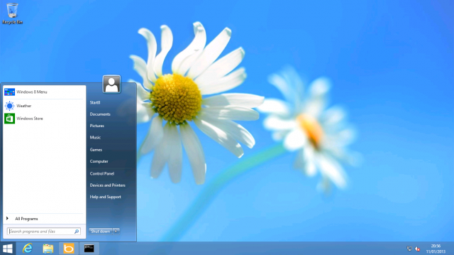
This app is almost similar technically as startisback, with some changes under the hood. It has a nice Windows logo at the bottom left of the screen which does not glow when the mouse is hovered over it. It does include selective disabling of hot corners, it does boot straight to the desktop and all the similar functions which you can expect.
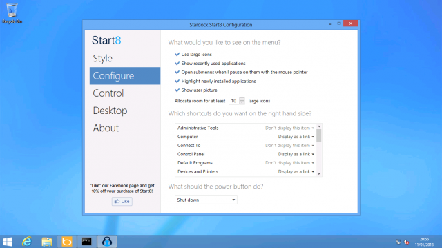
The settings page for Start8
There is one trick under the hood is that you can tell start8 to display the metro-styled UI in a portrait mode which may not run well but still worth a try. The settings page is pretty descent and straight forward as well as easy to navigate. The Start8 pricing starts at $4.99 per PC. I can’t really see the appeal. If a Windows 7 Start menu is what you want, StartIsBack offers the same for less money. Start8′s additional Start-screen-in-a-box menu doesn’t add much value as things currently stand.
The Classic Shell:-
This app is more old-school and the users familiar with the old XP style may prefer this app the most. Note that this app is poor in functionality and usage as it is slow and does not react to the users input properly, but this is rare and quite acceptable taking into consideration that it is a freeware.
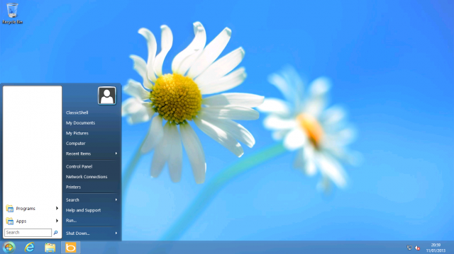
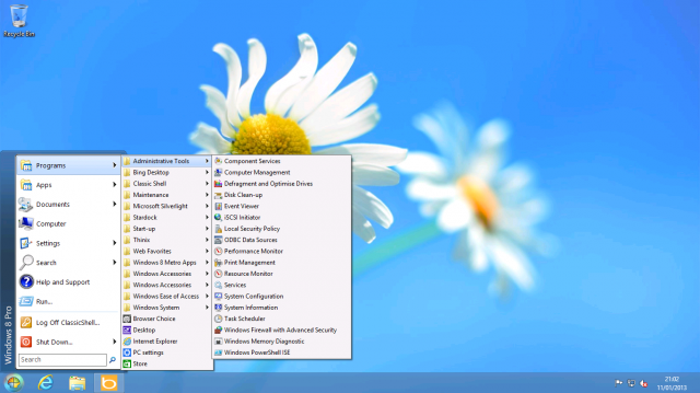
The classic shell drop down menu
You might fell the navigation a little sluggish, but since it’s free app it does not matter that much..
The settings page for Classic Shell
There are tons of settings in here and I don’t know why the developer has given so many options to tweak and tune it maybe it’s free that’s why i guess..
Pokki:-
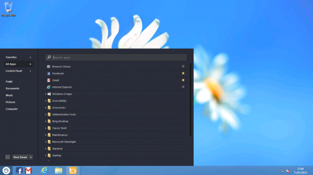
Now, pokki is totally different stuff from the rest, firstly it’s not free and there is no windows logo here. This project started in 2011 as a combined application marketplace and launcher. The notifications and the synchronization with the task bar is good. For example, the “Gmail app” includes a nice taskbar icon for Gmail with an overlay icon to show the number of unread messages. The Pokki launcher also provides a kind of notification center, aggregating all the notifications sent by Pokki apps.
The dropdown menu list or app list for pokki
There is not much difference here it’s almost the same as the other competitors, still providing solid black color in the background which makes the looks more aesthetic and royal.
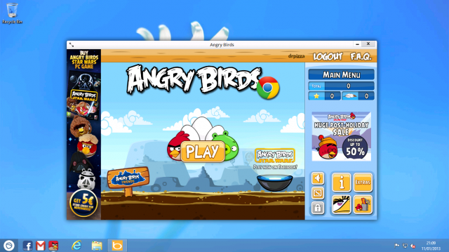
Angry Birds running as displayed by pokki..
Pokki is free app and behaves very well when it comes to HTML 5 games and apps..but this is just half of the story consider people using the same apps and games on google chrome browser or pinning the apps on IE….now pokki is in competition and it’s not going to change my browser habbits.
RetroUI:-
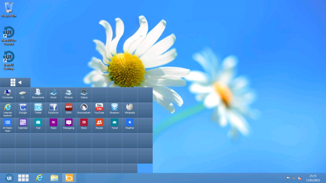
This app is interesting as well as frustrating, sounds weird here’s the reason why. RetroUI tries to reconcile Metro apps with the desktop. With feature called Enforce, the Start screen doesn’t cover the taskbar, and Metro apps get placed in (generally resizable) windows on the desktop. They can overlap and multitask and, in theory, coexist with regular desktop applications, though they don’t appear to get their own taskbar buttons, which slightly diminishes the effect.
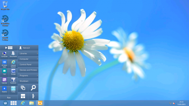
The menu as displayed in RetroUI app..
There’s also an issue of ugliness. RetroUI’s launcher is not to my tastes at all; it doesn’t use Windows 8′s styling, or even Windows 7′s Aero styling, so it looks wrong and disconnected from the rest of the operating system. The basic layout is the same as the two-pane Start menu; programs on the left, a menu of items such as Libraries and Computer on the right. The programs section, rather than using a traditional list of icons with their names instead has a more tile-like look. When you put the mouse over this list, a scrollbar appears, and in so doing, causes the menu to shift around and resize in order to make room.
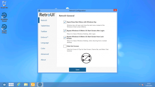
The default settings page for RetroUI..
Final comments:-
Well if you’re ready to pay more then start8 is for you and for a lesser price you can still get startisback which looks more authentic and well polished and user friendly. If you’re looking for a free alternative then classic shell wins any day and pokki is fun to use. The bad thing here is that if you wanna go for RetroUI or Pokki then it’s more of a learning curve and I suggest it’s better to learn the Metro UI first rather then going for any third party alternatives..
Njoy !
[Image courtesy:- Arstechnica & makeuseof.com]


